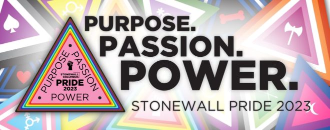
 For this year’s Pride logo, reflecting the theme of Purpose, Passion, and Power, we wanted to create something new that harkens to imagery that isn’t so new. Queer imagery and design has a rich history that reflects the tenacity, adaptability, and strength of our community. Whether a symbol was used to discreetly identify each other, reclaim an emblem of shame, or to revel in our collective power, images have been utilized throughout the years to give a visual narrative to our story.
Here are a few aspects of this year’s logo that reflect broader LGBTQ+ history and Stonewall Pride’s own as well:
- Triangular shape: In geometry, it is known that the triangles are the strongest shape. While a rectangle can collapse into itself from pressure to one of its points, triangles have a natural strength which supports structures against lateral pressures. In essence, each of the three sides supports the other two.
- This can be seen as a metaphor for our collective power – we cannot be crushed when we harness our Purpose. Passion. & Power.
- The pink triangle: This symbol was first used as a mark of shame in the Nazi concentration camps but was first reclaimed by activist groups prior to the popularization of Gilbert Baker’s timeless Rainbow Pride flag. Understandably, some activists were reluctant to adopt an image with such a morbid origin, but when faced with another form of persecution, organizers in both Silence = Death and ACT UP popularized the Pink Triangle again during the HIV/AIDS crisis.
- In a time when anti-Trans rhetoric and misinformation is ever present, we can see a parallel to our past with one of the first institutions to face destruction in Nazi Germany, Magnus Hirschfeld’s Institut für Sexualwissenschaft (Institute of Sexology). The first of its kind in the world, Hirschfeld created space for the research and practice of early gender affirming medical care. We can see today how those who choose to ignore our humanity are actively trying to impede on the rights of Trans folks to access vital medical care – an unfortunate reminder that history often can repeat itself without steadfast advocacy for our community’s needs.
- Along with anti-LGBTQ+ sentiment on the rise, we are again seeing an increase in antisemitism – not only for those who’s Queer identity intersects with their Jewish heritage, but it is also imperative that we listen and learn from our Jewish comrades in the fight for respect for all people.
- Radiating Rainbow (& other Pride flags): Drawing inspiration from Lisa McLymont’s PRIDE CIRCLES (2021)
- Lisa’s installation was celebrated in last year’s Pride logo, and we continue to be inspired by the radiating ripples of Pride. This year, we have also designed variant Pride logos to reflect a selection of other identities and Pride flags, including Aromantic, Asexual, Bisexual, Genderqueer, Intersex, Lesbian, Non-Binary, Pansexual, Polyamorous, and Transgender. We’ve also created variant logos for Bear, Leather, and Pup folks to celebrate their historical and cultural significance to our community.
- Black Power Fist: We are still living in a world that is disproportionately anti-Black, that prioritizes white comfortability over sustained change. There is still so much work to be done to acknowledge and dismantle white-supremacy – not only for folks living in the intersection of their Queer and Black identities, but it is also imperative to continue educating and fighting for collective liberation.
By Zac Boyer


